The Report Template defines the attributes and metrics
that are included in the output dataset and the layout when viewing the
results of the report. You may include any number of attributes and metrics
on a report. The attributes are used to determine the breakpoints for
the metric calculations.
There are two types of reports and each has a slightly
different template requirement as follows:
· Grid report
template layout
· Graph report
template layout
The Grid template view provides you with the design
layout for a grid report. As noted above, the template determines the
data elements to be included in the output dataset as well as their placement
on the grid.
Attributes may be placed independently as row headers,
column headers and/or the Page By. Metrics must be placed in the same
location on the grid, either all as row headers, column headers or Page
By. The most commonly placement of metrics on the grid are as columns
with attributes used as Page By and row elements to determine the pages
for your output and the breakpoints within the pages for metric calculations.
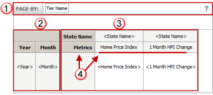
The following is the grid template layout:

|
Page
By Panel
This panel allows you to specify
the attributes you wish to use to create pages of output in your
dataset. The output is still one dataset, but the display in the
grid is paged by the attribute values.
In this example, there is only
one attribute (Data Period) that allows you to view the output
dataset as individual data periods. |
Design
View
|

|
Row
Headers
The attributes placed as row headers
will provide one row per combination of attribute reporting band
values. The metrics will be calculated for each intersection of
attribute reporting band values.
In this example, there are two
attributes (State and CLTV in 20% reporting bands). Since the
State attribute is first in the list, there will be one row for
each state and CLTV 20% reporting band (the CLTV 20% attribute
provides reporting bands in 20 percentage point increments after
the initial CLTV under 80%; 0 to 80%, 80%+ to 1000%, 100%+ to
120%, 120%+ to 140%, CTLV > 140%).

|

|
Column
Headers
Metrics are grouped together as
one heading level for reporting purposes; each metric is an individual
column on that same level.
If applicable, when you mix attributes
and metrics in the columns, the attributes placed a column
headers will provide one column per reporting band per metric
outlined below. |
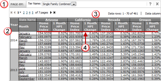
Output
View
|

|
You
will see one column header on the grid layout with the column
"detail" listed to its right. The column header "master"
represents the name of the attribute or the generic "Metrics"
header and the list of metrics that have been included in the
report.
In the detailed grid design display:
For attributes, the name of attribute
is repeated in the detail column. When you view actual output,
each reporting band for the attribute is presented.
For metrics, the individual metric
names are displayed.
In this example, the Conforming
Flag includes three values on the report for Conforming, Non-Conforming
and Jumbo Conforming; the Active Loan Count metric will be calculated
for each of these reporting bands. |
The Graph template view provides you with the design
layout for a graph report. As noted above, the template determines the
data elements to be included in the output dataset as well as their placement
on the graph. Additionally, you also define the type of graph format (e.g.,
horizontal bar, vertical line, scatter, 3-D, etc).
The example below for the graph template uses the report
layout as defined above for the grid example. Formatting for a graph differs
greatly from formatting for a grid, you may find you must move data elements
into different areas on the template to obtain a desirable graph layout.
On a graph, the Categories correspond to the Rows on a grid and the Series
(or plot lines) correspond to the columns on a grid.
Based on the special nature of the graph layout, the
following are some recommendations when designing a graph report layout:
· If
displaying more than one metric on the graph at the same time, keep in
mind the type of metric and the scale of the values (e.g., balance vs.
count, large values vs. small values). If you have disparate numeric formats
and/or values for the plotted series on the same graph, your view of the
output may not be optimal.
· Consider
placing the metrics on the Page By and view each metric as an individual
page from your output dataset. You must still consider the disparity in
the numeric values (e.g., loan balances in California will be typically
higher than in other states).
· Keep
the number of attributes in the series and/or categories creating the
metric breakpoints to a small number, too many attributes may lead to
a cluttered graph.
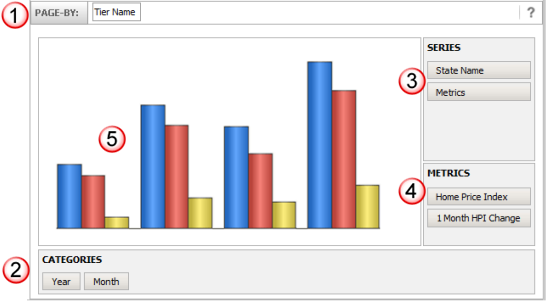
The following is the grid template layout:
Note: As noted above, the example
below is simply the Graph design view of the grid report detailed above.
This may not be the best use case of a graph layout, but it does demonstrate
all facets of the graph template.

|
Page
By Panel
This panel allows you to specify
the attributes you wish to use to create pages of output in your
dataset. The output is still one dataset, but the display in the
grid is paged by the attribute values.
In this example, there is only
one attribute (Data Period) that allows you to view the output
dataset as individual data periods.

|
Design
View

|

|
Categories
(correspond to Rows in Grid Layout)
Categories represent the axis at
the bottom of the graph, correspond to the rows of a grid and
are usually defined with attributes. The attributes placed as
categories will provide one plot point for the combination of
attribute reporting band values. The metrics will be calculated
for each intersection of attribute reporting band values.
In this example, there is one attribute
(State) and each plot point will represent an individual state
for each metric on the graph.
It is best to limit the number
of attributes used in the categories to assist with the ease of
reading the graphed data. |

|
Series
(Correspond to Columns in Grid Layout)
Series represent the plotted values
on the graph, correspond to the columns of a grid and are usually
metrics. Each metric is an individual plotted value on the graph
and the value is calculated based on the reporting bands of the
Categories.
If you include attributes in the
Series setup, each plot line represents a combination of attribute
reporting value and metric. The attribute reporting value will
be determined by the attribute setup and the report filters used
to generate the output dataset.
The data type, scale and range
of values for each of the metrics (e.g., count vs. dollar metrics
as well as high and low values) should be considered when
determining which metrics are to be included on the
report and how to present them. |

|
When
more than one metric is included in the series setup, each metric
is listed below the master "Metrics" series designator
and will each have their own plot line on the graph.
As noted above, when an attribute
is added to the Series setup, each of the metrics are combined
with the reporting bands of the attribute(s) to generate a plotted
series on the graph. In order to minimize the plotted series lines
on a graph, it is not recommended that you combine attributes
and metrics on a graph.
|
|

|
Graph
Type
A representation of the type
of graph you have selected is displayed in the graph body while
viewing it in Design Mode (in this example the graph type
is a vertical bar graph). |
![]()

![]()
![]()
![]()

![]()
